Vauxhall Meriva – the interior
Mon, 18 Jan 2010The interior of the 2010 Vauxhall Meriva
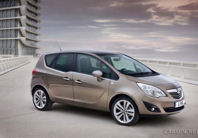
A couple of weeks ago Vauxhall revealed the details on the new Vauxhall Meriva and sent us a heap of pictures. Probably the biggest stand-out was the carry-over of the suicide doors from the original Meriva Concept (which we do have reservations about) but overall the new Meriva does look a more than half-decent car.
But one thing Vauxhall didn’t do was release any pictures of the interior. Wasn’t it finished? Were they trying to tease out the interest? Who knows, but they’ve decided to put things right and have now sent us details. Well, one picture. Which is better than none.
Vauxhall have been pretty clever with the interior on the Meriva. They’ve moved the dash forward and slimmed down the A-pillars, making the Meriva seem much roomier and lighter in the front. The slimmed-down A-pillars also improve driver visibility.
They’ve also had a play with the old Meriva’s FlexSpace seating and have made the rear seat cushions and backs slide and lower all together in one movement, and the outside seats in the back can now move backwards and forwards individually. They also move inwards to give more shoulder room if you’ve only got two in the back.
All this clever packaging coupled with things like the increased load capacity, the FlexRail storage system and the downward kink in the rear doors show how much thought has gone in to improving the 2010 Meriva over the outgoing model.
Another good addition to what is now probably the best range of cars Vauxhall has ever had.
By Cars UK


